
HOW TO USE COLOR THERAPY TO MAKE HOME STYLISH
Firstly, I’ll tell you that color therapy doesn’t just make your home look stylish—it enhances your daily lifestyle by shaping how you feel, think, and behave.
Color Therapy, also called Chromotherapy, is a healing and wellness practice that uses colors and light to influence a person’s mood, emotions, and even physical health. In short, Color therapy enhances your daily lifestyle by blending beauty, wellness, and mood balance. It makes your spaces not just look good—but feel good too.
Quick Hack:
If you don’t want to repaint walls, add color therapy through accessories – cushions, curtains, rugs, flowers, wall art, lampshades, or even colored glass vases.
Meaning of Color Therapy :
- It is based on the idea that each color carries a specific vibration or energy that can affect our mind and body.
- By surrounding ourselves with certain colors (through lighting, clothing, décor, or visualization), we can bring balance, positivity, and well-being into our lives.
How It Works:
- Warm colors (like red, orange, and yellow) are stimulating, energizing, and uplifting.
- Cool colors (like blue, green, violet) are calming, soothing, and relaxing.
- Neutral colors (like white, beige, gray) bring clarity and balance.
Practitioners believe that using the right colors can:
- Reduce stress
- Improve focus and energy
- Encourage better sleep
- Uplift mood and creativity
Examples in Daily Life :
- Wearing blue to feel calm before a big meeting.
- Painting a bedroom green to encourage relaxation.
- Using yellow in a study room to boost positivity and concentration.
So, here I’ll share some of my thoughts on a stylish breakdown of how you can use color therapy to make your home both beautiful and mood-boosting.
Color Therapy for a Stylish Home :

Living Room – Warm & Welcoming
- Colors: Soft yellows, warm oranges, orange with blue, and earthy beiges.
- Effect: Promotes happiness, optimism, and conversation.
- Style Tip: Add cushions, wall art, or rugs in these shades for a cozy yet stylish feel.
Bedroom – Calm & Relaxing
- Colors: Cool blues, lavenders, and pastel greens.
- Effect: Lowers stress, improves sleep, and creates a soothing atmosphere.
- Style Tip: Use bedding, curtains, or accent walls in these shades.
Kitchen & Dining – Energetic & Inviting
- Colors: Reds (for appetite), fresh greens, and sunny yellows.
- Effect: Red stimulates appetite, yellow lifts energy, and green keeps balance.
- Style Tip: Try colorful backsplash tiles, crockery, or table runners.
Study or Work Space – Focus & Creativity
- Colors: Light greens, wine red, shades of blue for clarity, and a touch of orange for creativity.
- Effect: Boosts productivity, mental clarity, and imagination.
- Style Tip: Add a green indoor plant, a blue desk lamp, or an orange accent chair.
Bathroom – Refresh & Rejuvenate
- Colors: Aqua blues, white, and soft turquoise.
- Effect: Gives a spa-like freshness and clears mental fatigue.
- Style Tip: Towels, candles, or tiles in aqua tones make it refreshing
Entryway – Positive First Impression
- Colors: Peach, coral, or light gold, Green.
- Effect: Welcoming, warm, and uplifting for both you and guests.
- Style Tip: Paint the door or use stylish wall décor in these tones.
Living Room – Warm & Welcoming

Like Amy Era Design does in this picture, orange with white give a very fresh look. An orange + white living room instantly feels warm, bright, and welcoming.

Earthy Beige + Yellow Living Room, Calm, natural, and uplifting. Beige grounds the space, and yellow adds sunshine. Best for a cozy yet happy vibe.

Beige is a neutral and timeless color that makes the living room look bright, spacious, and calming. It pairs well with white, brown.
Bedroom – Calm & Relaxing

A sky-color bedroom creates a calm, fresh, and relaxing vibe. Soft blue walls with white or beige accents make the space airy and peaceful, while light wood furniture and sheer curtains keep it natural and soothing – perfect for restful sleep.

A lavender bedroom feels calm, soothing, and elegant. Soft lavender tones on walls or bedding create a relaxing atmosphere, while pairing with plants and white, grey, or beige accents keeps it light and peaceful — perfect for stress-free rest and a touch of charm.

A forest green bedroom feels calm, grounding, and refreshing. Deep green walls or accents bring a natural, restful vibe, while pairing with beige, cream, or wooden furniture adds warmth and balance — perfect for a cozy and serene retreat.
Kitchen & Dining – Energetic & Inviting
I’m speechless. This red kitchen and dining space feels energetic, warm, and inviting. Red accents on walls, chairs, or décor stimulate appetite and conversation, while balancing with white, beige, or wood tones keeps the space lively yet elegant — perfect for family gatherings and social meals.

A light green kitchen and dining area feels fresh, energetic, and welcoming. The soft green shade brings a natural, healthy vibe, while pairing with lights, check how to decorate the kitchen, white, wood, or beige accents keep the space airy and cheerful — perfect for uplifting meals and family time.

A yellow kitchen and dining space feels bright, cheerful, and energizing. The sunny tones create a welcoming atmosphere, stimulate positivity, and pair beautifully with white, grey, or wood accents, making mealtimes lively and joyful.
Study or Work Space – Focus & Creativity

A pastel green study or workspace feels calm, refreshing, and creativity-boosting. The soft green shade reduces stress, improves focus, and pairs well with white or light wood furniture. . like Workscape bliss does, creating a balanced and inspiring environment for productive work or study

A wine-colored study or workspace feels bold and creativity-stimulating. The deep, rich tone adds focus and intensity while pairing well with beige, cream, or wooden accents, creating an elegant environment that inspires concentration and fresh ideas.

An orange with white workspace feels energetic, uplifting, and creativity-boosting. Orange sparks motivation and fresh ideas, while white balances it with clarity and focus, together creating a bright, inspiring environment for productive work or study.
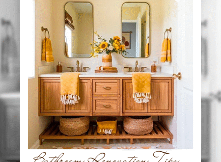
Bathroom – Refresh & Rejuvenate

I personally love this, A dark blue with golden bathroom feels luxurious, elegant, and rejuvenating. Deep blue tones create calm and depth, while golden accents add warmth and sophistication, together offering a spa-like yet royal atmosphere that refreshes both body and mind.

An aqua bathroom feels fresh, vibrant, and rejuvenating. The lively aqua tone brings a touch of the ocean, while pairing with white or sandy beige accents creates a bright, spa-like space, perfect for energizing mornings and relaxing evenings. like My elegant home create this in the picture.

A green bathroom with white and floral print feels natural, refreshing, and calming. Green adds a touch of nature and rejuvenation, while crisp white keeps the space clean and airy, together creating a spa-like atmosphere that soothes the mind and body. Soft green walls, white fixtures, and floral prints create a refreshing, elegant, and serene bathroom vibe.
Entryway – Positive First Impression

How lovely it is, an entryway in cream with touches of yellow, white, and sea blue feels bright, cheerful, and welcoming. Cream provides warmth, yellow adds positivity, white keeps it fresh, and sea blue brings calm. Together, creating a balanced and inviting first impression for your home.

An entryway with golden lights and a woody wall feels warm, elegant, and inviting. The soft golden glow highlights the natural texture of wood, creating a cozy yet classy atmosphere. This is Perfect for leaving a positive and welcoming first impression. Soft golden lights paired with rich wooden elements create a cozy, elegant, and inviting entrance.

How artfasad can think of using this color, A peach-colored entryway feels warm, friendly, and uplifting. This soft peach tone creates a welcoming glow, while pairing with white, cream, or wood accents adds freshness and balance, leaving guests with a cheerful first impression of your home.
How Color Therapy Enhances Daily Living
1. Boosts Your Mood Instantly
- Bright colors like yellow and orange lift your energy in the morning.
- Walking into a cheerful-colored space can make you feel motivated and positive.
Example: A yellow kitchen or bright cushions can make mornings feel lively.
2. Supports Better Sleep & Relaxation
- Cool colors like blue, lavender, and soft green reduce stress and calm the mind.
- These shades in the bedroom help you unwind after a hectic day.
Example: Blue bedsheets or dim lavender lighting encourage peaceful sleep.
3. Improves Focus & Productivity
- Greens and blues help with concentration and clear thinking.
- Orange accents stimulate creativity and problem-solving.
Example: A green plant or a blue desk lamp in your study boosts focus while working.
4. Encourages Healthy Eating & Socializing
- Red tones can stimulate appetite.
- Warm hues like peach and coral make dining areas welcoming for family and guests.
Example: Red tableware or a coral-toned dining wall makes meals feel more enjoyable.
5. Brings Balance & Harmony
- Neutral colors like beige, white, and pastels create balance and reduce overstimulation.
- They act as a grounding backdrop for other vibrant colors.
Example: A white entryway with colorful artwork gives a fresh, balanced welcome.
6. Creates a Stylish Personality for Your Home
- Using the right mix of therapeutic colors makes your home not only beautiful but also aligned with your lifestyle needs.
- It reflects your personality while enhancing emotional well-being.
Like: A calm spa-like bathroom in aqua tones or a bold, energizing living room with earthy orange highlights.
I hope you will love this post.
See you in the post. Bye bye 🙂


4 Comments
Pingback:
Pingback:
Pingback:
Pingback: